Cumulative Frequency and Boxplots
Cumulative Frequency and Boxplots Revision
Cumulative Frequency and Boxplots
A cumulative frequency graph can be used to estimate the interquartile range.
A boxplot is a graph that shows the median, quartiles, highest/lowest values and outliers.
Make sure you are happy with the following topics before continuing.
Cumulative Frequency Graphs
Suppose we have a table showing classes and frequencies, such as for histograms. We can find the cumulative frequency by adding on a column in which we add up the frequencies as we go. To create a cumulative frequency graph, we plot these cumulative frequencies as y values against the top of each class as x values, then join the points up with straight lines.
To estimate the interquartile range from these graphs, we draw lines from the y axis at \dfrac{n}{4} and \dfrac{3n}{4} and find the corresponding x values, which are our quartiles.
Boxplots
Boxplots are diagrams that look like this:


A Level Maths Predicted Papers 2024
The MME A level maths predicted papers are an excellent way to practise, using authentic exam style questions that are unique to our papers. Our examiners have studied A level maths past papers to develop predicted A level maths exam questions in an authentic exam format. The profit from every pack is reinvested into making free content on MME, which benefits millions of learners across the country.

A Level Maths Revision Cards
The best A level maths revision cards for AQA, Edexcel, OCR, MEI and WJEC. MME is here to help you prepare effectively for your A Level maths exams. The profit from every pack is reinvested into making free content on MME, which benefits millions of learners across the country.


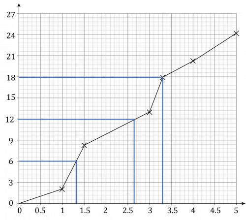
Example 1: Cumulative Frequency Graph
Draw a cumulative frequency graph from this data and estimate the interquartile range.
[4 marks]

Step 1: Add a high point column and cumulative frequency column to the table.

Step 2: Plot cumulative frequency against high point.

Step 3: Draw lines at cumulative frequencies of 25 (first quartile) and 75 (third quartile) and read off the x values.

Step 4: The estimate for the interquartile range is 26.5-10=16.5
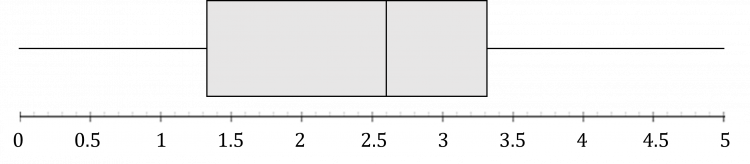
Example 2: Boxplots
Create a boxplot for the following data: 1,9,11,12,15,16,18 where a point is considered to be an outlier if it is more than the interquartile range lower than the first quartile or higher than the third quartile.
[6 marks]
There are 7 data points.
\dfrac{7}{4}=1.75 so the first quartile is the second data point, which is 9.
\dfrac{3\times 7}{4}=5.25 so the third quartile is the sixth data point, which is 16.
The interquartile range is therefore 16-9=7
So points less than 9-7=2 or greater than 16+7=23 are outliers. So there is one outlier in our data set, at the point 1
The lowest non-outlier value is 9, and the highest non-outlier value is 18
Finally, the median is 12.

Cumulative Frequency and Boxplots Example Questions
Question 1: Create a cumulative frequency graph from the following table:

[3 marks]
Add high point and cumulative frequency columns.

Plot high point against cumulative frequency.
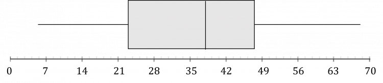
Question 2: Make a boxplot from the following data:
5,11,17,21,22,24,28,31,32,36\\40,41,44,45,46,48,51,54,58,68
[5 marks]
There are 20 data points.
\dfrac{20}{4}=5 so the first quartile is the midpoint between the fifth and sixth point, which is \dfrac{22+24}{2}=23
\dfrac{3\times 20}{4}=15 so the third quartile is the midpoint between the 15th and 16th point, which is \dfrac{46+48}{2}=47
\dfrac{20}{2}=10 so the second quartile (median) is the midpoint between the 10th and 11th point, which is \dfrac{36+40}{2}=38
The lowest and highest values are 5 and 68.
This gives the following box plot:
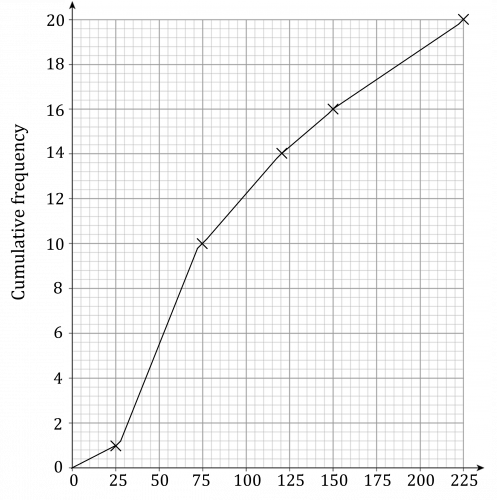
Question 3: Create a box plot by estimating the quartiles from a cumulative frequency graph for the following data:

[8 marks]
Add high point and cumulative frequency onto the table.

Plot high point against cumulative frequency on the graph.
Use the graph to determine:
First quartile =1.3
Median =2.6
Third quartile =3.3
Create the box plot.
You May Also Like...

MME Learning Portal
Online exams, practice questions and revision videos for every GCSE level 9-1 topic! No fees, no trial period, just totally free access to the UK’s best GCSE maths revision platform.
