Revise
Box Plots
Box Plots Revision
Box Plots
A box plot (sometimes also called a ‘box and whisker plot’) is one of the many ways we can display a set of data that has been collected. The box plot tells you some important pieces of information: The lowest value, highest value, median and quartiles.
Make sure you are happy with the following topics before continuing.
Box and Whisker Plots
Here’s an example of a box plot for data collected on people’s shoe sizes. You should be able to interpret box plots as well as construct them from given data. First, we will go through what all the bits mean.

Range – The smallest shoe size was 1.5 and the largest was 13, from this we can calculate the range.
\text{Range } = \text{largest value } - \text{ smallest value } = 13 - 1.5 = 11.5
The range is one way of measuring the spread of the data, for more information head over here (Mean Median Mode and Range revision).
Interquartile range (or IQR) is another measure of spread of data. To do this, we need the quartiles. To find the interquartile range we subtract the lower quartile (Q_1) from the upper quartile (Q_3). So, reading from the box plot we get:
\text{Interquartile range } = Q_3 - Q_1 = 10 - 4 = 6
The interquartile range is a good measure of spread because it is unaffected by any outliers – data points which sit far away from all the other.
Note: Finding the IQR is a very common question so learn how to do it; it is the preferred measure of spread.
Median: – The median (Q_2) is always shown on a box plot by the middle line. Here, it is 8


Example 1: Constructing a Box Plot
Construct a box plot for the following data set.
3, 5, 8, 8, 9, 11, 12, 12, 13, 13, 16
[3 marks]
Considering that the lower quartile is a quarter of the way through and the upper quartile is 3 quarters of the way through, we get:
Lower Quartile = \dfrac{n + 1}{4}th term & Upper Quartile = \dfrac{3(n + 1)}{4}th term.
This set of data contains 11 numbers, so we get the following.
- The median is the \dfrac{11 + 1}{2} = 6\text{th} term, so \text{median } = 11.
- The lower quartile is the \dfrac{11 + 1}{4} = 3\text{rd} term, so Q_1 = 8.
- The upper quartile is the \dfrac{3(11+1)}{4} = 9\text{th} term, so Q_3 = 13.
Now we have all the information we need to draw a box plot. Recall where everything goes from the picture above, and the result looks like this:

Example 2: Comparing Box Plots
The following box plots show how many hours of TV is watched by a year 11 class (orange) and a year 9 class (grey) in a given month. Compare the box plots.
[2 marks]

When comparing box plots you want to look at the median and interquartile range as your first two comparisons.
The median time is greater for the year 9 class.
The year 9 class also have a larger interquartile range.
Box Plots Example Questions
Question 1: The box plot below was constructed from a collection of times taken to run a 100 m sprint. Using the box plot, determine the range and interquartile range.
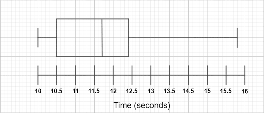
[2 marks]
For the range, we need to subtract the smallest value from the largest. From the graph, we can see that the smallest value is 10 and the largest is 15.8, so:
\text{Range } = 15.8 - 10 = 5.8\text{ seconds}.
For the interquartile range, we need to subtract the lower quartile from the upper quartile. From the graph, we can see that the lower quartile is 10.5 and the upper quartile is 12.4, so:
\text{Interquartile range } = 12.4 - 10.5 = 1.9\text{ seconds}.

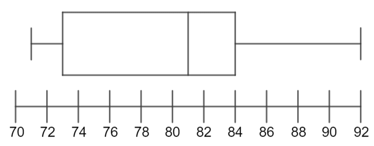
Question 2: A class of students sat an exam. Their total marks, out of a possible 100, were recorded. The following are facts about the data recorded on the students’ scores. Use this information to construct a complete box plot.
- \text{Largest value }= 92
- \text{Lower quartile } = 73
- \text{Median } = 81
- \text{Range } = 21
- \text{Inter-quartile range } = 11
[4 marks]
Although we have plenty of information, we are still missing a few keys values in order to draw a completed box plot. Specifically, we are missing the upper quartile and the lowest value.
The range is the smallest value subtracted from the largest value, so if we subtract the range from the largest value we will be able to work out the smallest value:
\text{Smallest value } = 92 - 21 = 71
The interquartile range is the lower quartile subtracted from the upper quartile, so if we add the interquartile range to the lower quartile, we will be able to work out the upper quartile:
\text{Upper quartile } = 73 + 11 = 84
We now have all the information we need to plot the box plot. Your completed box plot should be similar to the below:
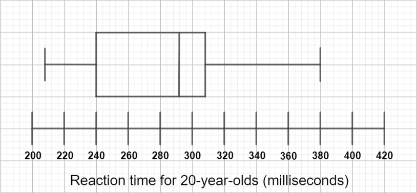
Question 3: The reaction times (in milliseconds) of a group of 20-year-olds and a group of 30-year-olds were tested. The reaction times for the 20-year-olds has been plotted below:
The reaction times for the 30-year-olds are as follows:
220, 252, 256, 312, 332, 332, 400
Construct a box plot for this set of the data and note two differences between the two groups.
[4 marks]
To construct a box plot, we need the smallest value, the largest value, the median, and the lower and upper quartiles. We have the smallest value (220) and the largest value (400), so we will have to work out the remaining values.
The median is the \dfrac{7+1}{2} = 4th term, which is 312.
The lower quartile is the \dfrac{7+1}{4} = 2nd term, which is 252.
The upper quartile is the \dfrac{3(7+1)}{4} = 6th term, which is 332.
Now we have all the necessary details to draw the box plot, which should be similar to this:
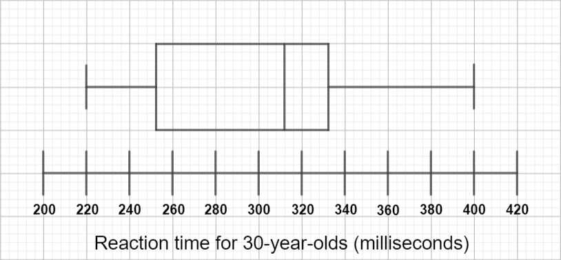
Comparing the two box plots, we can see that the second one has a higher median, meaning that the 30-year-olds were on average slower at reacting than the 20-year-olds.
Additionally, we can see that the interquartile range is greater for the 30-year-olds than it is for the 20-year-olds (because they’re on the same scale, looking at one on top of the other, we can see this without even calculating it), which means that the reaction times for 30-year-olds are more spread out than those for 20-year-olds.
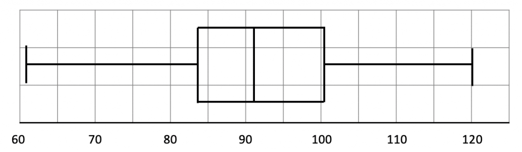
Question 4: The below cumulative frequency graph shows the weight of 100 people who attend Weight Watchers.
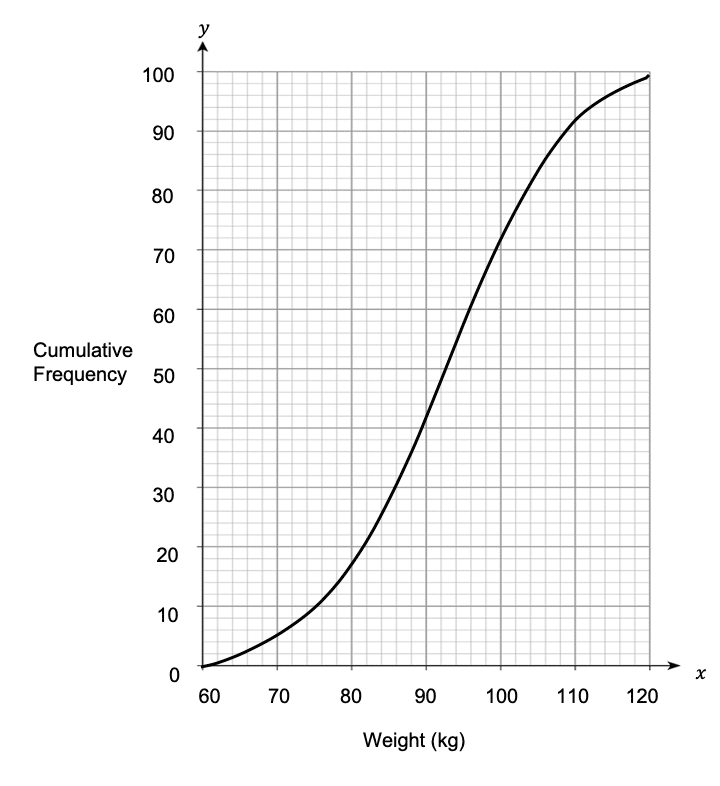
The weight of the lightest member was 61 kilograms and the weight of the heaviest member was 135. Draw a box plot to show the distribution of the Weight Watchers members.
[3 marks]
In order to draw our box plot, we need the following values:
- The lowest weight
- The highest weight
- The median weight
- The lower quartile weight
- The upper quartile weight
The lowest weight has been given as 61 kilograms and the highest weight is 135 kilograms, so these weights will be at either end of the box plot.
We know that there are 100 values in total, so the median is the 50th value. On the cumulative frequency graph, we need to locate 50 on the cumulative frequency axis and find the corresponding weight in kilograms. The 50th value has a weight of 92 kilograms, so the line in the middle of the box in the box plot will fall on 92.
Since there are 100 values in total, the lower quartile is the 25th value. On the cumulative frequency graph, we need to locate 25 on the cumulative frequency axis and find the corresponding weight in kilograms. The 25th value has a weight of 84 kilograms.
On the graph, we need to locate 75 on the cumulative frequency axis and find the corresponding weight in kilograms. The 75th value has a weight of 101 kilograms.
As a result, the completed box plot should be similar to the one below:
Question 5: The cumulative frequency graph below shows the salaries of 100 employees who work for Welsh Bank (black) and 100 employees who work for the Bank of Finland (blue).
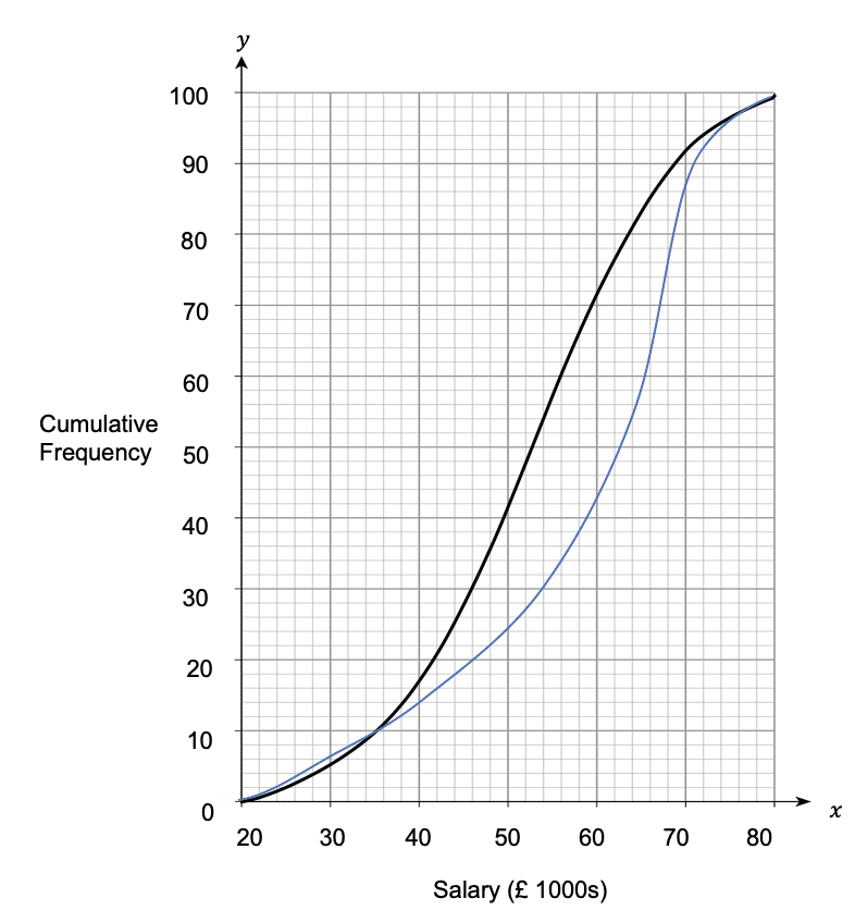
a) Draw two separate box plots to represent the spread of salaries at each bank.
[3 marks]
b) From the box plots, make 2 comparisons between the data sets.
[2 marks]
a) In order to draw our box plots, we will need the following values for each bank:
- The lowest salary
- The highest salary
- The median salary
- The lower quartile salary
- The upper quartile salary
To find the lowest salaries, we need to find what 0 on the cumulative frequency axis corresponds to. For Welsh Bank and for the Bank of Finland, it is £21,000.
To find the highest salaries, we need to find what 100 on the cumulative frequency axis corresponds to. For Welsh Bank and for the Bank of Finland, it is £80,000.
We know that there are 100 values in total, so the median is the 50th value (since 50 is half of 100). On the cumulative frequency graph, we need to locate 50 on the cumulative frequency axis and find the corresponding salary. The 50th value for Welsh Bank corresponds to a salary of £52,000, and the 50th value for the Bank of Finland corresponds to a salary of £62,000.
Since there are 100 values in total, the lower quartile is the 25th value (since 25 is \frac{1}{4} of 100. On the cumulative frequency graph, we need to locate 25 on the cumulative frequency axis and find the corresponding salary. The 25th value for Welsh Bank corresponds to a salary of £44,000, and the 25th value for the Bank of Finland corresponds to a salary of £50,000.
Since there are 100 values in total, the upper quartile is the 75th value (since 75 is \frac{3}{4} of 100. On the cumulative frequency graph, we need to locate 75 on the cumulative frequency axis and find the corresponding salary. The 75th value for Welsh Bank corresponds to a salary of £61,000, and the 75th value for The Bank of Finland corresponds to a salary of £68,000.
As a result, the completed box plots should be similar to the two below:
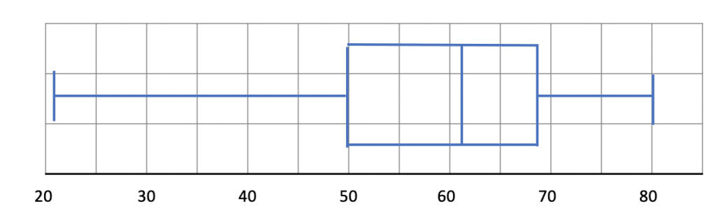
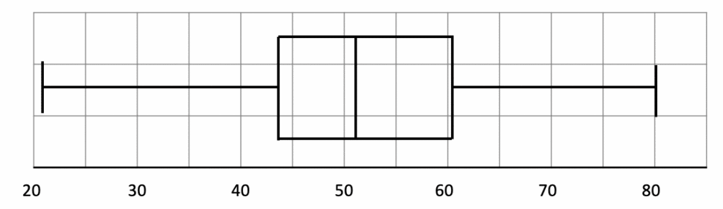
b) By comparing the two box plots, we can see that:
- the median salary is higher at the Bank of Finland (£62,000 compared to £52,000). Therefore, people earn more on average at the Bank of Finland than at Welsh Bank.
- the salaries at Welsh Bank and Bank of Finland are equally consistent (since the interquartile range, £18,000, is the same for both.
