Histograms (Basics)
Histograms (Basics) Revision
Histograms (Basics)
Histograms are a way to represent continuous data from a grouped frequency table.
The class widths can vary in size, however on this page only histograms with equal class widths will be discussed. Students sitting the higher exam should refer to this page on histograms.
Even though histograms with equal class width can look very similar to bar charts, there is actually 1 important difference, which is that the bars do not have gaps in between them.
Make sure you are happy with the following topics before continuing.
Constructing Histograms

As mentioned above, histograms are used to display continuous data, which will be given to you in the form of a grouped frequency table. The grouped frequency table on the right shows the height of some different plants.
Using the data in the table, then choose a suitable scale for your x and y axes.
The x-axis will display the different classes, which in this case is the heights of some plants. The y-axis will display the corresponding frequencies.

Example 1: Reading from a Histogram
The histogram below, shows the speeds of different cars driving through a 30 \text{ mph} zone. Use the histogram to complete the grouped frequency table.
[2 marks]

The middle bar is 8 units tall, therefore 1 unit =40\div8=5 students.
This can then be used to complete the values for the y-axis, as shown below.


Now simply read off the frequencies to complete the table.
Example 2: Estimating from a Histogram
The histogram shown below shows the weight of some different students in year 10.

Use the histogram to estimate the amount of students who weigh more than 58 \text{ kg}.
[2 marks]
To estimate the amount of students heavier than 58 \text{ kg}, we can draw a vertical line from 58 \text{ kg}.

Using this line, we can see that \dfrac{2}{10} of the 50<w\leq 60 bar and all of the 60<w\leq 70 and 70<w\leq 80 bars are above 58 \text{ kg}.
Reading from the histogram, the estimate for the amount of students heavier than 58 \text{ kg} is:
\dfrac{2}{10}\times 30 + 19 + 9=34
Note: This is only an estimate, as we are not given the specific weights of individual students within each class width.
Histograms (Basics) Example Questions
Question 1: The grouped frequency table below shows the heights of students in year 11.
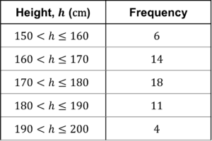
Construct a histogram to represent this data.
[3 marks]
Choosing a suitable scale for both the x and y axes, your histogram should look similar to this:
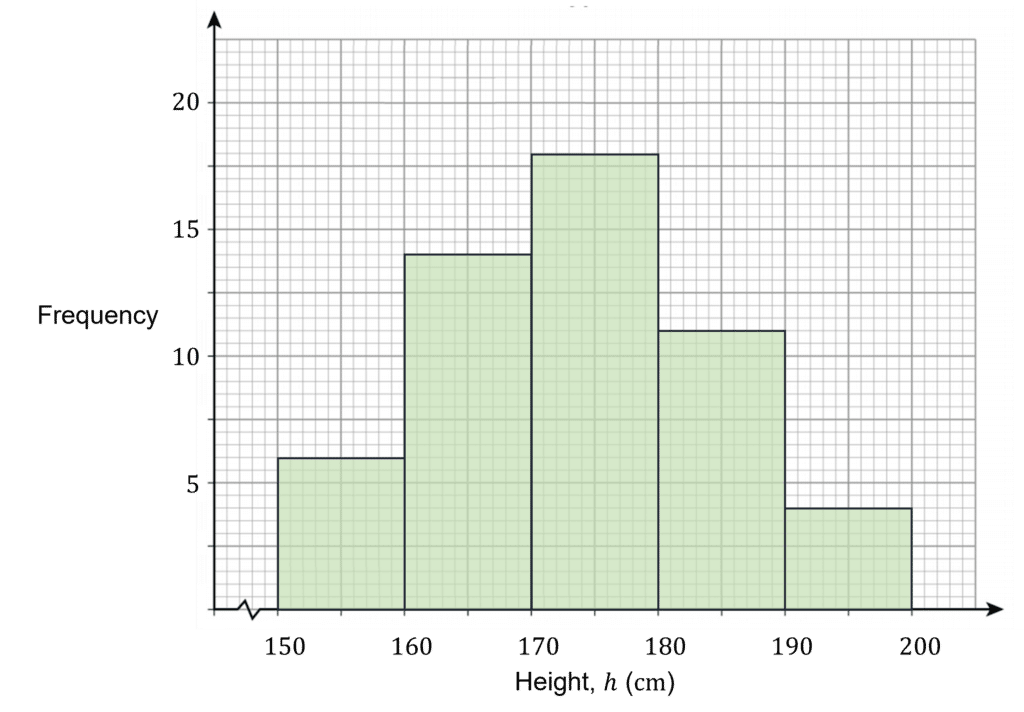
Note: The squiggle or sideways ‘Z’ on the x-axis, shows that part of the scale has been cut off. This is because starting at 0 wouldn’t be practical, given the minimum possible value is 150 \text{ cm}.
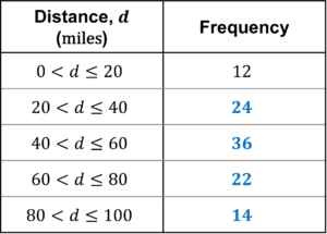
Question 2: Use the histogram shown below to complete the grouped frequency table, which shows the distances cycled in one week by members of a cycling club.
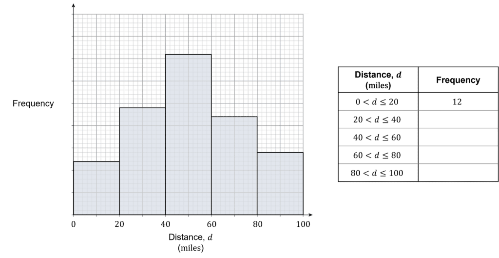
[2 marks]
The first bar is 2.4 units tall, so 1 unit =12\div2.4=5 people.
The y axis scale can then be added as shown below.
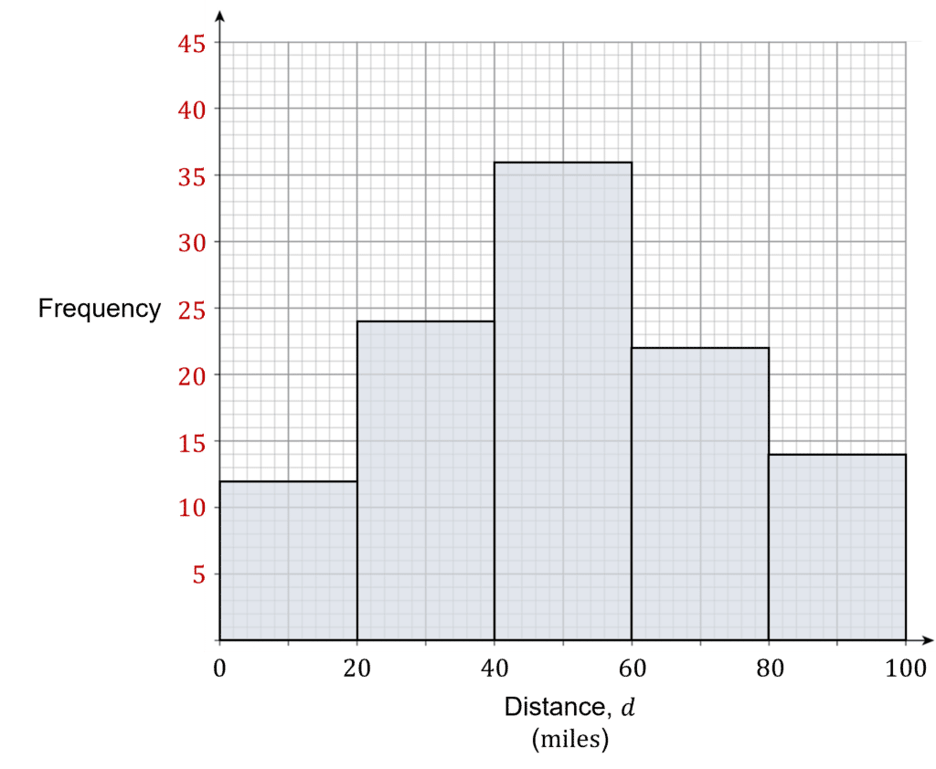
Reading off the histogram, the grouped frequency table can then be completed.
Question 3: The histogram below shows some data on the average temperature of days in the months of August, September and October.
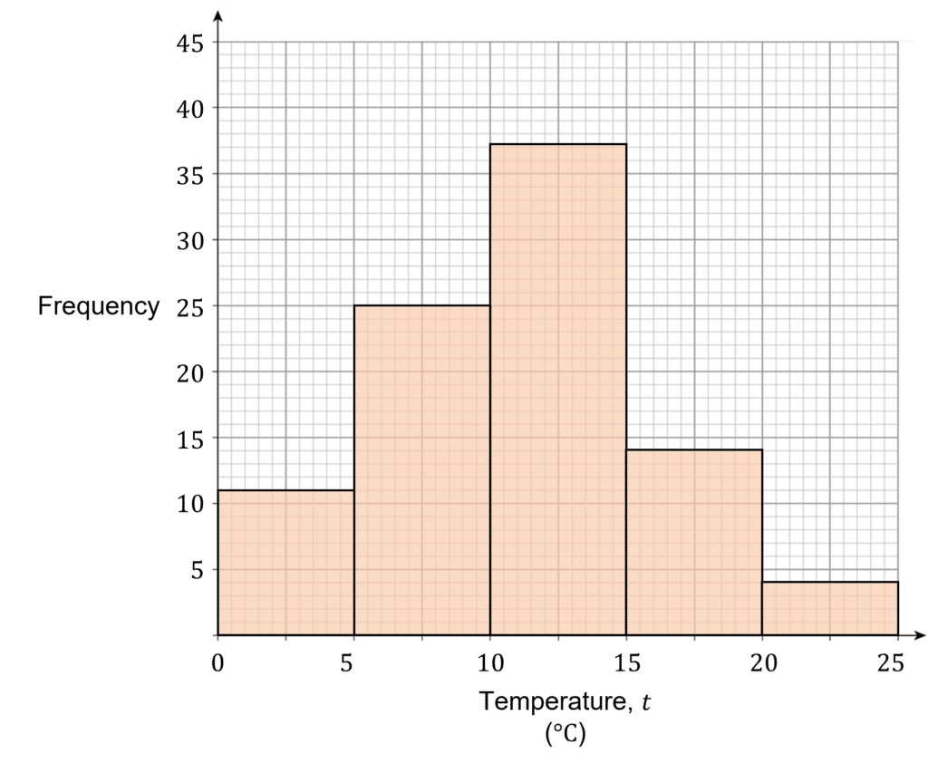
The average temperature in the UK is approximately 9\degree \text{C}.
Use the histogram to estimate on how many days in August, September and October were above the yearly average temperature.
[2 marks]
Using the histogram, we can see that \dfrac{1}{5} of the 5<t\leq10 is above 9\degree \text{C}, as well as the bars 10<t\leq15, 15<t\leq20 and 20<t\leq25.
Therefore we can estimate that:
\dfrac{1}{5}\times25+37+14+4=60 days were above the yearly average in August, September and October.
You May Also Like...

MME Learning Portal
Online exams, practice questions and revision videos for every GCSE level 9-1 topic! No fees, no trial period, just totally free access to the UK’s best GCSE maths revision platform.
