Revise
Histograms
Histograms Revision
Histograms
When displaying grouped data, especially continuous data, a histogram is often the best way to do it – specifically in cases where not all the groups/classes are the same width. Histograms are like bar charts with 2 key differences:
- There are no gaps between the bars
- It’s the area (as opposed to the height) of each bar that tells you the frequency of that class.
Make sure you are happy with the following topics before continuing.
Frequency Density
In order to make this work, when drawing a histogram, we plot frequency density on the y-axis rather than frequency. The frequency density for each group is found using the formula:
\text{frequency density} = \dfrac{\text{frequency}}{\text{class width}}
Example 1: Drawing a Histogram
Below is a grouped frequency table of the lengths of 71 pieces of string.
Construct a histogram of the data.
[4 marks]

To construct a histogram, we will need the frequency density for each class. Dividing the frequency of the first class by its width, we get
\text{frequency density } =\dfrac{8}{20-0} = 0.4

Once we have calculated the frequency density with the remaining groups, then it is good to add a third column to the table containing the frequency density values, see the completed table.
Once this new column is completed, all that remains is to plot the histogram.
With lengths on the x-axis and frequency density on the y-axis, each bar that we draw will have width equal to its class width, and height equal to the relevant frequency density.
The resulting histogram is shown.

Example 2: Interpreting Histograms
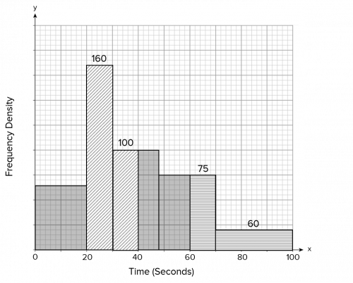
Below is a histogram showing the times taken to complete a quiz.
44 people took between 0 and 1.5 minutes.
Work out how many people took between 3 and 4 minutes.
[4 marks]

To answer this question, we’re going to use the information to work out how much 1 small square of area is worth.
Between 0 and 1.5 minutes includes all of the first bar and some of the second. From 0 to 1 minutes there are 10\times 12 =120 small squares, and from 1 to 1.5 there are 5\times 20=100 small squares (marked on the graph below for clarity).

So, in total there are 100+120=220 small squares between 0 and 1.5 minutes, and the question tells us that this accounts for 44 people. Therefore, 1 person is equal to
220 \div 44=5\text{ small squares}.
Now, reading from the graph we get that there are 11 \times 10 = 110 small squares between 3 and 4 minutes, so given that 5 small squares is one person, there must be
110 \div 5 = 22\text{ people}
who took between 3 and 4 minutes to do the quiz.
Histograms Example Questions
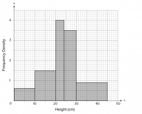
Question 1: Below is a grouped frequency table showing the heights of plants growing in a garden.

Construct a histogram of this data.
[4 marks]
In order to draw a histogram, we need to know the frequency density for each row of data. The frequency density is calculated by dividing each frequency by its associated class width.
This means that we need to create a new column on the data table for the frequency densities.
The first row of the table has a plant height from 0 - 10cm and a frequency of 6. As mentioned above, the frequency density is the frequency divided by the band width, so the frequency density for the first row can be calculated as follows:
\text{Frequency density} = 6 \div10 = 0.6
By repeating this process for the remaining four rows, our completed frequency density column will look like the one below:

Now we are in a position to draw the histogram. The height will be on the the x-axis and the frequency density on the y-axis. Since the band widths are not consistent (the band width of the 20 - 24 cm category is only 4 cm whereas the band width for the 30 - 50 cm category is 20 cm), this means that the widths of the bars you draw will not be the same.
Your completed histogram should look like the one below:

Question 2: Below is a histogram showing how long people can hold their breath.
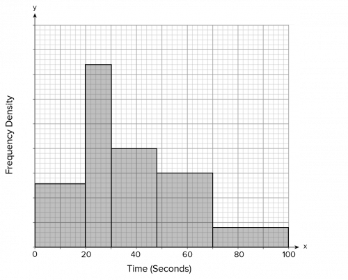
There were 54 people who could hold it for at least 1 minute.
Work out how many could hold their breath for between 20 and 40 seconds.
[4 marks]
The number of values in each class is represented by the area of each bar (and not the height). We have been told that 54 people can hold their breath for at least a minute, so this means that the area of the bars from 60 seconds upwards represents 54 people.
People who can hold their breath for 1 minute or more is represented by the whole of the last bar (70 - 100 seconds) and the right-hand part of the second-to-last bar (60 - 70 seconds). To work out the area in these two bars, we simply need to count the small squares:
(5 \times 15) + (15 \times 4) = 75 + 60 = 135
This is illustrated in red on the histogram below.
If 135 small squares represents 54 people, we can work out how many people one small square represents:
If
54\text{ people} = 135\text{ small squares}
then:
\text{1 person } = \dfrac{135}{54} = 2.5\text{ small squares}
Now that we know that 1 person is represented by 2.5 small squares, we need to work out how many small squares there are between 20 and 40 seconds.
The number of small squares between 20 and 40 is:
(5 \times 37) + (5 \times 20) = 185 + 100 = 285
This is illustrated in green on the graph below.
Therefore, the number of people who can hold their breath for between 20 and 40 seconds is:
\dfrac{285}{2.5} = 114\text{ people}
Question 3: Some cyclists from a local cycling club go out for their usual Sunday ride. There are many different lengths of routes to suit cyclists of all abilities.
The histogram below shows this information:
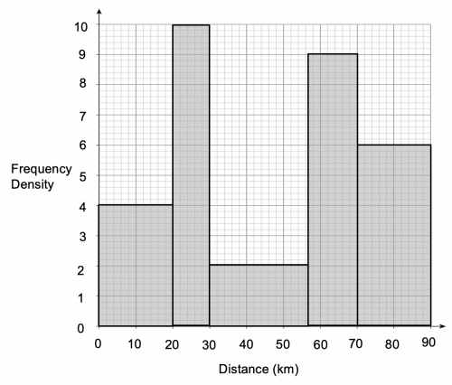
a) Estimate the number of cyclists who rode for 30 kilometres or less.
[4 marks]
b) Find an estimate for the mean journey length to the nearest kilometre.
[4 marks]
a) Since we are taking data from the histogram, we can see the frequency density and the band width, but we need to work out how many riders (the frequency) rode for 30 kilometres or less.
The key formula when we are dealing with histograms is:
\text{Frequency density} = \dfrac{\text{frequency}}{\text{bandwidth}}
If we need to work out the frequency, then we simply need to rearrange this formula:
If
\text{Frequency density} = \dfrac{\text{frequency}}{\text{bandwidth}}
then
\text{Frequency} = \text{ frequency density}\times\text{ bandwidth}
The number of riders (the frequency) who rode between 0 and 20 kilometres can be calculated as follows:
4\times20 = 80\text{ riders}
The number of riders (the frequency) who rode between 20 and 30 kilometres can be calculated as follows:
10\times10 = 100\text{ riders}
Therefore the number of riders who rode between 0 and 30 kilometres is:
80+100=180\text{ riders}
b) In order to work out the mean journey length, we need to work out how many riders there are in total. In order to do this, we need to work out how many riders rode between 0 – 20 kilometres, 20 – 30 kilometres, 30 – 54 kilometres etc.
We already know from the previous question that 80 riders rode between 0 and 20 kilometres and that a further 100 riders rode between 20 and 30 kilometres.
In the 30 – 57 kilometres category, we have a band width of 27 kilometres and a frequency density of 2, so the number of riders can be calculated as follows:
27\times2 = 54\text{ riders}
In the 57 – 70 kilometres category, we have a band width of 13 kilometres and a frequency density of 9, so the number of riders can be calculated as follows:
13\times9 = 117\text{ riders}
In the 70 – 90 kilometres category, we have a band width of 20 kilometres and a frequency density of 6, so the number of riders can be calculated as follows:
20\times6 = 120\text{ riders}
Although we now exactly how many riders rode in each distance category, we cannot know exactly how far each rider rode since we are dealing with grouped data. In the 0 – 20 kilometres category, the 80 riders could have cycled 1 kilometre or 19 kilometres. What we have to do is assume that the distance that each cyclist rode is the midpoint of each distance category (this is why this is an estimated mean and not an accurate mean).
The easiest thing for us to do is to tabulate our data, with one column for the midpoint of each distance category, another column for the frequency (number of riders) and another column for the midpoint multiplied by the frequency (this last column is to work out the total distance travelled by all the riders in that category combined because to work out the mean, we will need to divide the total distance travelled by all riders by the number of riders).
The tabulated data should look like the below:
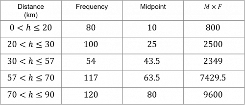
The total of the frequency column is the total number of riders. The total of the ‘midpoint multiplied by frequency column’ is the total distance travelled by all of the riders. Therefore the estimated mean can be calculated as follows:
\text{Estimated mean} = 22678.5\text{ kilometres} \div \text471\text{ riders} \approx 48\text{ kilometres}
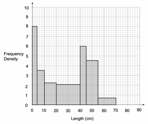
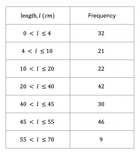
Question 4: The table shows information about the length of fish caught by some fisherman at a local lake:
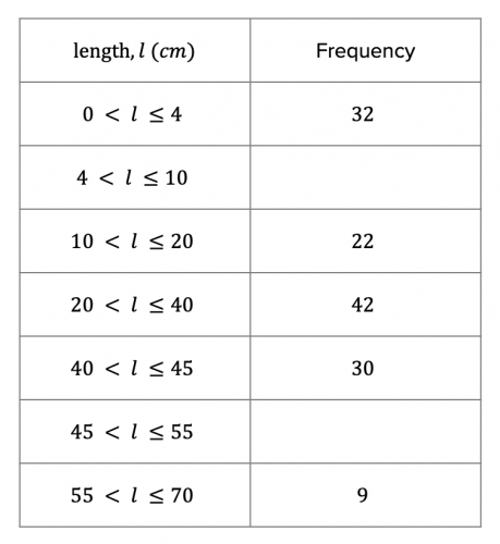
a) Use the information on the table to complete the histogram:
[3 marks]
b) Use the histogram to complete the table above.
[2 marks]
a) In order to complete the rest of the histogram, we need to work out the frequency densities for the length categories which have not already been drawn on the histogram.
The frequency density for the 0 – 4 cm length category can be calculated as follows:
\text{Frequency density} = 32 \div 4 = 8
The frequency density for the 10– 20 cm length category can be calculated as follows:
\text{Frequency density} = 22 \div 10 = 2.2
The frequency density for the 20 – 40 cm length category can be calculated as follows:
\text{Frequency density} = 42 \div 20 = 2.1
The frequency density for the 40 – 45 cm length category can be calculated as follows:
\text{Frequency density} = 30 \div 5 = 6
The frequency density for the 55 – 70 cm length category can be calculated as follows:
\text{Frequency density} = 9 \div 15 = 0.6
Now that we have worked out the frequency density for each length category, we can now plot them on the histogram, with a result similar to the below:
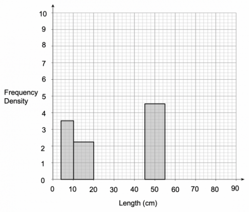
b) For this part of the question, we need to fill in the gaps in the frequency column of the table. In order to do this, we will need to take a frequency density reading from the histogram for the 2 length categories in question.
Reading from the histogram, we see that the frequency density for the 4 – 10 cm category is 3.5, and the frequency density for the 45 - 55 cm category is 4.6. All we need to do is rearrange the frequency density formula so that we can work out the frequency.
Since
\text{Frequency density} = \dfrac{\text{frequency}}{\text{bandwidth}}
then
\text{Frequency} =\text{frequency density}\times\text{bandwidth}
Therefore, the frequency for the 4 – 10 cm length category can be calculated as follows:
3.5\times6=21
The frequency for the 45 – 55 cm length category can be calculated as follows:
4.6\times10=46
Question 5: A baker for a large supermarket has received a total of 185 bags of flour from different suppliers. As a result, the bags he has received are of varying weights.
The histogram shows information about the weight of the bags of flour:
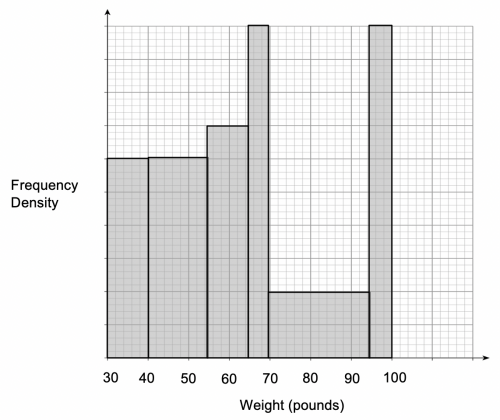
15 bags of flour weigh between 35 and 40 pounds.
a) How many bags of flour weigh more than 80 pounds?
[2 marks]
b) Explain why your answer or part a) is only an estimate.
[1 mark]
c) What is the median weight of a bag of flour?
[3 marks]
a) The key piece of information in this question is that 15 bags of flour weigh between 35 and 40 pounds. What we need to do is look and see what area of the histogram this represents. The area of the 35 – 40 pounds bar (do not accidentally work out the area of the entire 30 – 40 pounds bar!) can be calculated as follows:
2.5\times30\text{ small squares} = 75\text{ small squares}
We can therefore conclude that 15 bags of flour is represented by 75 small squares.
If
15\text{ bags} = 75\text { small squares}
then
1\text{ bag} = 5\text { small squares}
All we need to do now is work out how many small squares there are from 80 pounds upwards.
Between 80 and 95 pounds there are 75 small squares, and between 95 and 100 pounds, there are a further 125 small squares, giving us a total of 200 small squares.
Since 5 small squares represents a single bag of flour, then 200 squares represents 40 bags of flour.
b) The answer to part a) can only be an estimate because we are dealing with grouped data. We have made the assumption that the number of bags that weigh between 80 and 95 pounds is \frac{3}{5} of the number of bags of flour that weigh between 70 and 95 pounds. At one extreme, it is possible that all of these bags of flour are less than 80 pounds and, at the other extreme, it is possible that they might all weigh more than 80 pounds.
c) We know from the question that there are 185 bags of flour in total. Therefore the median weight of a bag of flour is the weight of the 93^{\text{rd}} bag (since 93 is the ‘mid-point’ of 185). We will therefore need to work out which weight band the 93^{\text{rd}} bag of flour falls into. This is going to be difficult (impossible) at this stage since we do not know how many bags of flour are in the 30 – 40 pound category, the 40 – 55 pound category etc.
We know from the first question, that 15 bags of flour weigh between 35 and 40 pounds. Since this is half of the total of the 30 – 40 pound category, the number of bags between 30 and 40 pounds is:
15\times2 = 30\text{ bags}
In the 40 – 55 pound category, the area is 1.5 times the 30 – 40 pound strip, so this represents:
30\times1.5 = 45\text{ bags}
So far we have accounted for the first 75 bags of flour (50+75=125) so haven’t reached the 93^{\text{rd}} bag of flour yet.
The 55 – 65 pound category has the same width as the 30 – 40 pound category. If we compare the area to the 30 – 40 pound category, its area is 25 small squares larger than the 30 – 40 pound category. Therefore, once we know what an area of 25 small squares represents, we can add this to 30 (the number of bags represented by the 30 – 40 pound category).
We know from the first question that 5 small squares corresponds to 1 bag, so 25 small squares will correspond to 5 bags.
Therefore the 55 – 65 pound category corresponds to 35 bags.
Since there are 30 bags in the 30 – 40 pound category and a further 45 bags in the 40 – 55 pound category, there are 75 bags that have a weight between 30 and 55 pounds. Therefore the 55 – 65 pound category accounts for the 76^{\text{th}} bag to the 110^{\text{th}} bag (110 since there are 75 bags between 30 and 55 pounds and 35 bags between 55 and 65 pounds). We are trying to locate the weight of the 93^{\text{rd}} bag, so we know it must be in the 55 to 65 pound weight category.
We are now in a position to calculate the estimated weight of the 93^{\text{rd}} bag (this is the hard bit!).
By subtracting the 75 bags that weigh less than 55 pounds from 93, we can work out that the 93^{\text{rd}} bag will be the 18^{\text{th}} of the 35 bags between 55 and 65 pounds. We can write this as \frac{18}{35}. So where in the weight category does this fall? It will fall \frac{18}{35} of the way between 55 – 65 pounds. Since this is a weight category of 10 pounds, we will need to perform the following calculation:
\dfrac{18}{35}\times10=5.14\text{ pounds}
Since the category starts at 55 pounds, then the weight of the median bag (the 93^{\text{rd}}) bag is 55+5.14=60.14 \text{ pounds}
(This last part seems complicated, but only because the fraction is not that easy. If there were 20 bags in the 55 – 65 pound category, and it was the 10^{\text{th}} bag in this category that represented the median, since the 10^{\text{th}} bag in the category is exactly half way through the 20 bags in the category, then its estimated weight would simply be half way between 55 and 65 pounds, so would therefore have a weight of 60 pounds.)
Histograms Worksheet and Example Questions
(NEW) Histograms Exam Style Questions - MME
Level 6-7GCSENewOfficial MMEHistograms Drill Questions
Histograms 1 - Drill Questions
Level 6-7GCSEHistograms 2 - Drill Questions
Level 6-7GCSE
MME Premium Membership
£19.99
/monthLearn an entire GCSE course for maths, English and science on the most comprehensive online learning platform. With revision explainer videos & notes, practice questions, topic tests and full mock exams for each topic on every course, it’s easy to Learn and Revise with the MME Learning Portal.
Sign Up Now