Revise
Scatter Graphs
Scatter Graphs Revision
Scatter Graphs
Scatter graphs are a tool that we use to display data with two variables. Having a good knowledge of gradients of lines will help you to understand correlation, which forms a large part of the scatter graph topic.
Correlation
The aim of drawing a scatter graph is to determine if there is a link or relationship between the two variables that have been plotted. If yes, then we say there is correlation.

There are two types of correlation:
- Positive correlation – as one variable increases, the other one also increases.
- Negative correlation – as one variable increases, the other decreases.
We can also comment on how strong the correlation is. If all the points are very closely aligned (either in negative or positive correlation), then we say that there is strong correlation. If there is correlation but the points are quite spread out, we say that there is weak correlation.
It is important to note: if you see a correlation between two variables, this does not necessarily mean that one of the variables is causing the other. For example, there may be a correlation between the number of people swimming in the sea, and the number of people buying ice cream, but this does not mean that buying ice cream is causing people to go swimming in the sea. It is more likely warm weather is causing people to buy ice cream and swim in the sea. This may be written as, “correlation does not imply causation”.

Drawing the Line of Best Fit
A line of best fit is used to represent the correlation of the data.
In other words, the line of best fit gives us a clear outline of the relationship between the two variables, and it gives us a tool to make predictions about future data points.
It helps a lot to have a clear ruler and sharp pencil when drawing a line of best fit. You should draw the the line so that it goes through the middle of all the scatter points on a graph with an equal number of points on either side of the line.


Example 1: Plotting Scatter Graphs
Below is a table of 11 student’s scores out of 100 on their Maths and English tests. Plot a scatter graph from this data.
[3 marks]

We will put the Maths mark on the x-axis and the English mark on the y-axis. Then, we plot each individual student’s Maths mark against their English mark in the way that we normally plot coordinates.
Looking at this graph, we can see that, in general, as people’s grades in Maths increase, their grades in English tend to decrease. So, there is negative correlation between Maths and English grades.
Example 2: Using the Line of Best Fit
Use the following scatter graph to predict the English mark of someone who managed a mark of 60 in Maths.
[2 marks]
To do this, we draw a straight, vertical line up from 60 on the Maths axis until we hit the line of best fit.
Then, we draw a horizontal line across from that point to the English axis. It touches that axis at 50, so 50 is the predicted English grade.
The point (60, 50) on the graph is right in the middle of the data collected. When we make predictions within the range of our data like this, it is known an interpolation and is generally quite reliable. When we make predictions outside of the range of our data, that is known as extrapolation and is less reliable as we don’t know if or when a correlation will change. To extrapolate data, you would first extend the line of best fit, then make a prediction.
Scatter Graphs Example Questions
Question 1: For each of the scatter graphs below, state whether or not there is correlation and, if so, state the strength and type of correlation.
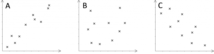
[3 marks]
a) In general, we can see that as the x variable increases, the y variable also increases. This indicates that there is a positive correlation. Since all the points are close together in a straight line (if you draw in a line of best fit, then the points would not be far from this line), this graph has strong positive correlation.
b) There is no clear pattern here (the points seem to be scattered at random), so this graph has no correlation.
c) As the x variable increases, the y variable decreases, so there is a negative correlation. Since all the points are reasonably close to the line of best fit, this graph has moderate negative correlation.

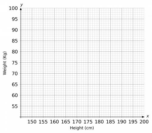
Question 2: Rey recorded the heights and weights of her students in the table below:

a) Draw a scatter graph of this data and state the type and strength of correlation.
[3 marks]
b) Draw a line of best fit and use it to predict the weight of someone who has a height of 190cm.
[2 marks]
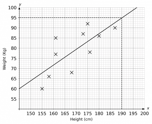
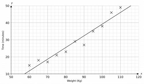
a) The results of plotting the ten points on a graph should look like the below:
 As far as the scale is concerned, since the heights and weights do not start from 0, it would be a good idea to jump to an appropriate starting point, such as 150 cm for the height and 60 kg for the weight.
b) The line of best fit will cut through what you believe to be the middle of all the points and should be similar to the green line below:
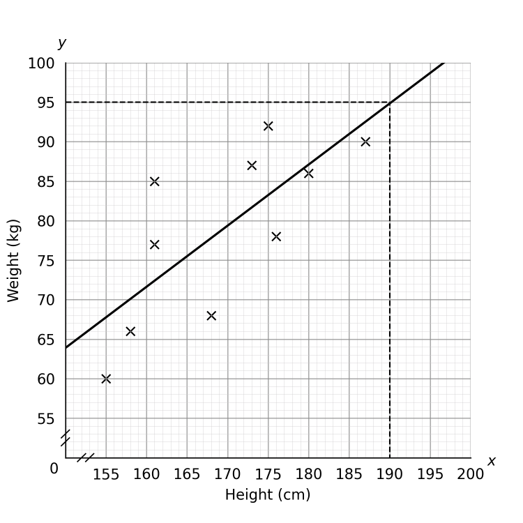
To predict the weight of someone with a height of 190cm, locate 190 on the horizontal x-axis and draw a vertical line up to your line of best fit. Then draw across from this point to the corresponding value on the y-axis. The prediction, according to this line of best fit, is 95kg. This is shown with the red lines below:
(Your line of best fit may be slightly different, in which case any answers between 93kg and 97kg are acceptable.)
Question 3: The temperature of a cup of tea is recorded over time. The results are shown in the table below:

a) Draw a scatter graph for the above data.
 [3 marks]
b) Describe the correlation between the time and the temperature of the cup of tea.
[1 mark]
c) Describe the relationship shown in the scatter graph.
[1 mark]
d) What is the estimate for the temperature of a cup of tea after 6 minutes?
[1 mark]
e) Explain why it might not be appropriate to use the scatter graph to best estimate the temperature of a cup of tea after 45 minutes.
[1 mark]
a) Since time is the first row of the data table, time should be on the x-axis. As far as your scale is concerned, on the x-axis, it would make sense to go up in increments of one or two minutes. On the y-axis, you can use can go up in increments of 10 or 20 degrees. (Since the temperature starts at 45\degree and goes up to 95\degree, you could start your temperature at 40\degree instead of 0\degree if you prefer.)
Your completed scatter graph should look like the below:
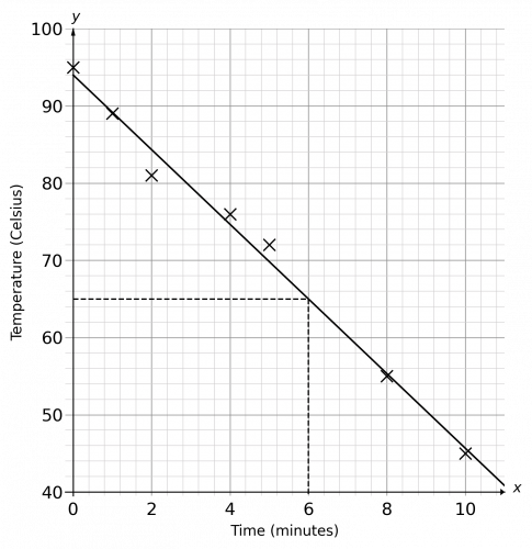
b) In order to work out what type of correlation there is, we need to draw in a line of best fit. Draw a line that cuts through the middle of as many of the dots as possible. As the x variable increases, the y variable decreases, so there is a negative correlation. Since all the points are very close to the line of best fit, this graph has strong negative correlation.
c) Since the y variable decreases as the x variable increases, this tells us that the temperature of the cup of tea is reducing over time (the cup of tea is getting colder over time).
d) In order to find an estimate for the temperature of the cup of tea after 6 minutes, we need to locate 6 minutes on the x-axis and draw a vertical line from 6 until it touches your line of best fit, then draw a horizontal line to the left to find the corresponding temperature value. The estimated temperature is 66\degree. (A couple of degrees above or below 66 will be acceptable since drawing the line of best fit is never that precise.)
e) It would be inappropriate to find an estimate for the temperature after 45 minutes as 45 minutes is beyond the range of the data.
(The temperature of the cup of tea will not continue to drop forever. After a certain amount of time, the cup of tea will reach room temperature and will stay at this temperature. This could be before 45 minutes have elapsed.)
Question 4: In a test, some runners of differing weights were asked to run 5 kilometres as fast as they can. Their results are shown in the table below:

a) Draw a scatter graph to represent the above information.
 [3 marks]
b) Describe the correlation between the time taken and the weight of the runner.
[1 mark]
c) Describe the relationship shown in the scatter graph.
[1 mark]
d) Why might it not be appropriate to use the scatter graph to best estimate the 5 kilometre time of someone who weighed 40 kilograms?
[1 mark]
a) Since time is the first row of the data table, time should be on the y-axis.
As far as your scale is concerned, on the x-axis, it would make sense to use one box to represent 10 kilograms in weight. Since there are no values between 0 and 50, it makes sense to start the scale from 50. On the y-axis, you can use one large box, or even two large boxes for every 10 minutes.
Your completed scatter graph should look like the below:
b) As the x variable increases, the y variable increases, so there is a positive correlation. Since all the points are very close to the line of best fit, this graph has strong positive correlation.
c) Since the y variable increases as the x variable increases, this tells us that the time taken to run 5 kilometres is greater for a heavier runner (the heavier the runner, the slower the time / the lighter the runner, the quicker the time).
d) It would be inappropriate to find an estimate for the time taken for a runner of 40 kilograms since 40 kilograms is beyond the range of the data.
Although the data suggests that the lighter you are, the quicker you are, there has to be a limit. Taking this to a ridiculous extreme, a person could practically starve themselves to death, but this would not likely make them a fast runner!
Question 5: The table below shows the amount of time a group of students spent revising for an end of year exam and the score they achieved in the exam:

a) Draw a scatter graph to represent the above information.
[3 marks]
b) Describe the type of correlation shown.
[1 mark]
c) Describe the relationship between the time spent revising and the score achieved in the exam.
[1 mark]
d) One point on the graph is an outlier. How many hours of revision did this student do?
[1 mark]
e) Predict the exam score of a student who completes 22 hours of revision.
[1 mark]
f) Explain why it might not be appropriate to use the scatter graph to best estimate the exam score for a student who spent 85 hours revising.
[1 mark]
a) Since the top row of the data is the number of hours of revising, this should be plotted on the x-axis and the exam score should be plotted on the y-axis. As far as the scale is concerned, the hours range from 0 to 25, so it would be sensible to use either a large box (or half a large box) for every 5 hours. As far as the exam results are concerned, they range from 20 to 85, so it would be sensible to start at 0 and finish at 90 or 100, with each large box representing a change of 10 marks.
Your completed scatter graph should look like the one below:
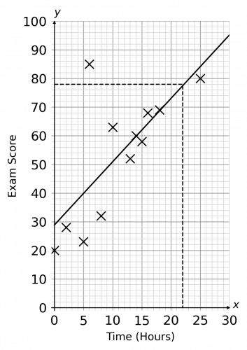
b) In order to work out the type of correlation shown, you will need to draw in a line of best fit. This line should go through the middle of as many of the points as possible. Since the line of best fit goes up and, generally, the points are close to this line, there is a positive correlation.
c) Since the y values (the exam scores) increase as the x values (time spent revising) increase, we can say that the more revision you do, the better your exam score is likely to be.
d) An outlier is any point which is a long way from the line of best fit. From the completed scatter graph above, we can see that there is one point which is much further from the line of best fit than any of the other points, and this is the point that corresponds to the student who scored 85 with only 6 hours of revision.
(You don’t even need the scatter graph to see that this point is the outlier as it is quite clear in the table too; the student achieved the best result of the group with barely any revision.)
e) For this question, we need to locate 22 hours on the x-axis, draw a line vertically up until it touches the line of best fit, and then draw a line across to the corresponding exam score on the y-axis. As you can see below, 22 hours of revision corresponds to an exam score of approximately 73 marks. (This is an approximation, so a score that is a couple marks above or below this is still acceptable.)
f) It would be inappropriate to find an estimate for an exam score for a student doing 85 hours of revision as this is beyond the range of the data.
(Presumably the exam has a maximum score, which might be achievable with, say, 40 hours of revision. Doing 85 hours of revision will not allow you to score greater than the maximum possible score.)
